Making a Fantasy Book Cover
I’m a book cover designer who works largely with self published fantasy novels. These days, most of my covers use a combination of stock photos and 3D models posed in DAZ Studios.
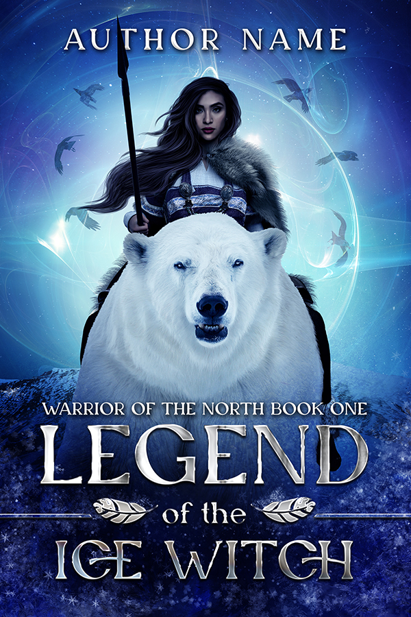
For the example piece, I’m going to be using “Legend of the Ice Witch” which tied for second in a cover design competition!

Before you start designing…
It’s crucial that you do your research and know your genre. Matching genre standards is so important for indie fiction. You need readers of that genre to immediately recognize the book is something they’d want to read. Anyone making a book cover (either for themself or a client) needs to have a deep understanding of that genre. Before you start the art piece, you need to do your research
I typically do my research on Amazon, Goodreads, and Pinterest. You obviously want to be familiar with the Amazon bestsellers, since most indies are sold on Amazon. When looking at covers in your genre, here are some questions to think about.
- How much space does the text take up?
- How large is the figure?
- Setting/costume/posing?
- What type of font?
- What sort of colors?
- How much contrast?
For more information on the research stage, you can check out my previous blog post, “Making a Book Cover: Everything Before Opening Photoshop.”
Next comes stock images…
My covers tend to work off either a stock photo or a concept. This was a concept, “woman riding polar bear.” So I went looking for a bear and a woman’s face (I planned to build the body with DAZ).
I list some stock sites in this blog post, but I mostly use Deposit Photos for faces. I use Deposit Photos because I can get the credits on sale (this is why loads of designers use it). I keep favorites folders for faces, outfits, animals, etc, so whenever I need a photo, I start with what I’ve already saved.
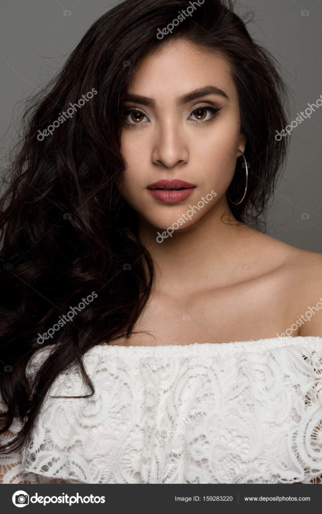
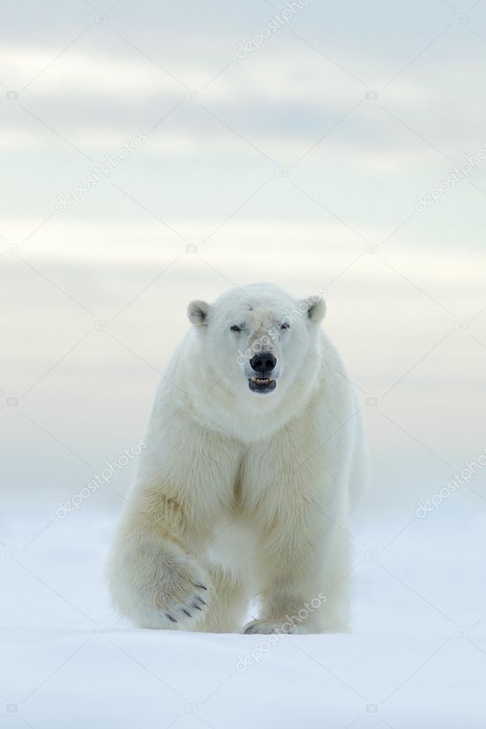
Both of these images are of good quality, have good lighting, and have good angles.
It is so important to use paid licensed stock photos for any sort of commercial work and to follow the licensing terms. Free sites like Unsplash often contain stolen images that people have been sued for using. And importantly, they don’t require model consent forms. Consent matters, and any model used in commercial art needs to have signed a model consent form.
Then I go to DAZ Studios…
DAZ is a theoretically free 3D posing software (the reality is that I’ve spent a lot of money on assets and add-ons for it.) I use it in combination with stock photos since it…
1) Lets me have more fantasy-genre appropriate costumes and poses
2) Lets me get a wider range of diversity than what is offered by stock photos.
I start with the pose then add clothes…
I usually start with a prefab pose then make adjustments. I want to make sure the pose I chose matches up with the angles and positioning of the stock photos! That’s why I start with stock photos.
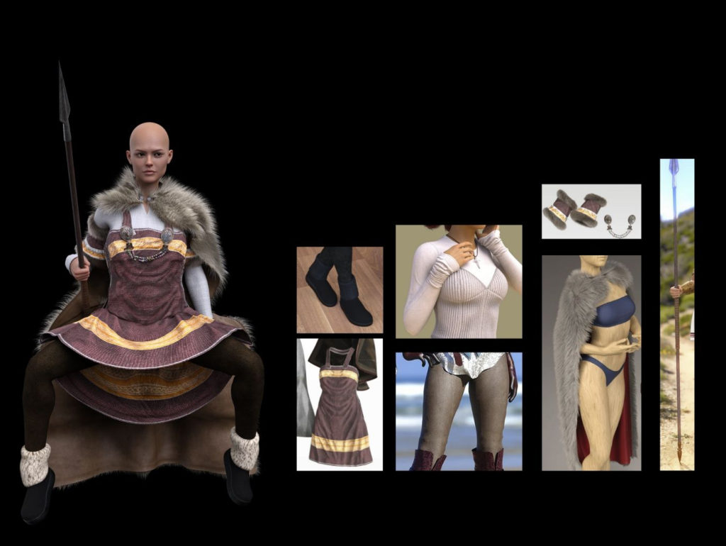
I’ll often mix and match from different outfits and change out textures to get something unique. Sometimes I’ll add hair, but for this one, I left her bald since I intended to paint it in. There’s a lot more that goes into this (especially since sometimes skin or layerd clothing will poke through) but I don’t want to go into the details of how to use DAZ here.
Now on to Photoshop!
Then I move everything into a Photoshop file and roughly lay out all the main parts. Including text! For a book cover, it’s super important to know where the text goes. For premade book covers like this one, I design in a square but stick a template on top to show me what it will look like once it’s cropped to 6 by 9 inches.
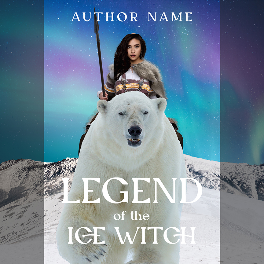
Big Picture/Small Picture: Thumbnails & Contrast
“How does it look small” really matters since that’s the size shown first on Amazon, where most indies are sold. I want the figure and the text to be clearly visible, so I add some magic behind her to help create contrast and put her and the bear in shadow. I’m thinking in terms of shapes, value and contrast.
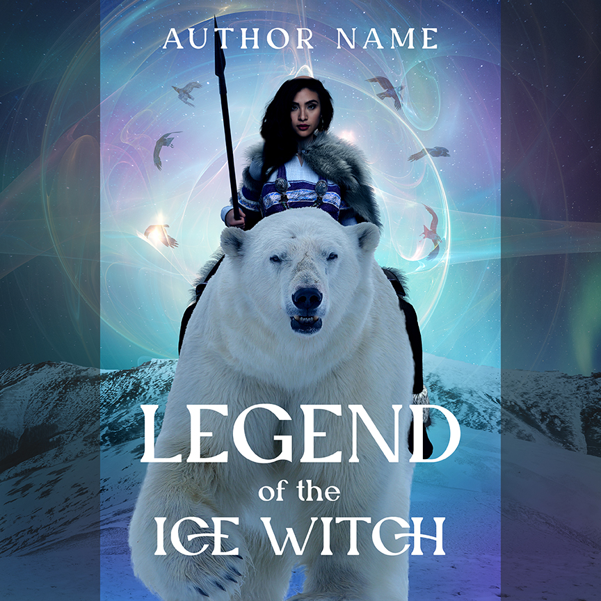
I keep working on that thumbnail…
I wanted to push it further, add even more focus to the figure, so I darkened the surroundings. I also started to layout some of the smaller elements like her hair and some blowing snow. But I’m still thinking about the big picture in terms of color and contrast.
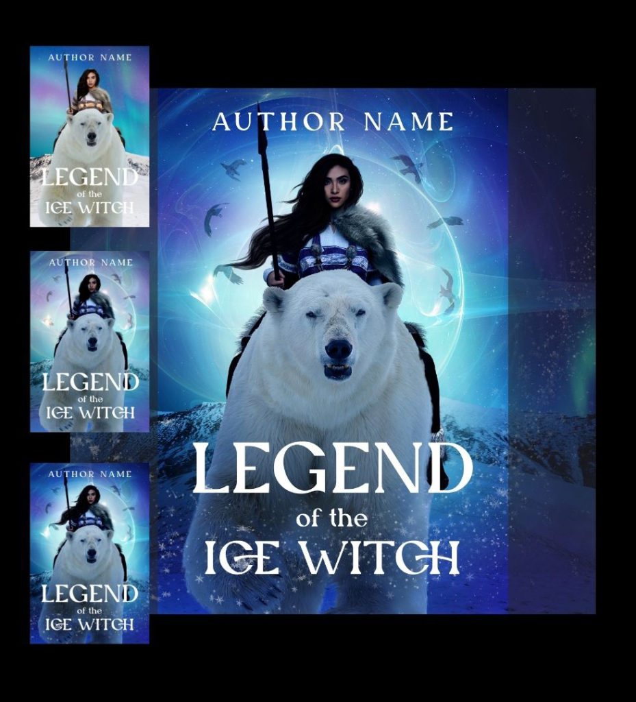
Detail work & the final cover
I overlay some texture, paint in some ice, smooth the skin, detail the hair, do some hand painting on the bear, and style the text, among other things. Small stuff that doesn’t impact the thumbnail comes last… but it can be some of the most time consuming parts of the cover. But it’s what adds the “wow.”
