3 Things That Make a Good Book Cover
As a book cover designer, I see some common mistakes both from authors’ DIYing and designers new to book covers. And even for authors who aren’t DIYing, it’s important that they have some basic information so they can evaluate potential covers and designers.
I will be focusing on indie book covers and using indie fantasy covers for examples, but most of this applies to other fiction genres for self published books! Examples are being pulled from Amazon bestsellers, since most indie books are sold through Amazon.
Some important notes:
- Self published covers are different than covers from traditional publishers. Trad pub has more ways of marketing books.
- Covers are a marketing tool. Art is subjective, but marketing is less so.
- I’m defining “good” as “marketable.” I want indie authors to make a living!
So without further adieu, let’s dive into the main list!
1. A good cover clearly shows its genre.
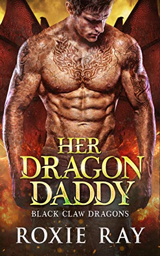
Look at this cover for Her Dragon Daddy. If the title didn’t clue you in, there’s all sorts of clues that this is a sexy dragon shifter romance:
-
-
-
- A shirtless, muscular man
- Wings
- Fire colors
- Fantasy style serif fonts
- A shirtless, muscular man
-
-
Her Dragon Daddy isn’t the sort of book I’d be interested in reading, but I’m not the target audience. And this cover is excellent at reaching the right audience. If you’re someone who likes books about sexy male dragon shifters, you can take one look at this cover and know it’s the sort of thing you’d like to read. Her Dragon Daddy is thus an excellent book cover. Be more like Her Dragon Daddy.
Different genres have different “clues”! If you’re looking to self publish, you need to learn the signals of your genre and make covers that match. The best way to do this? Research and mood boards! Cram so many covers into your brain that you know the language of your genre. If you want to know more about moodboards, you can check out my previous article “Making a Book Cover: Everything Before Opening Photoshop.”
2) A good book cover works at a small size.
Most indie books are sold on Amazon, where the covers are first displayed as small thumbnails. Potential readers decide based off those thumbnails if they’ll click on the book!
So your cover needs to look good at a small size.
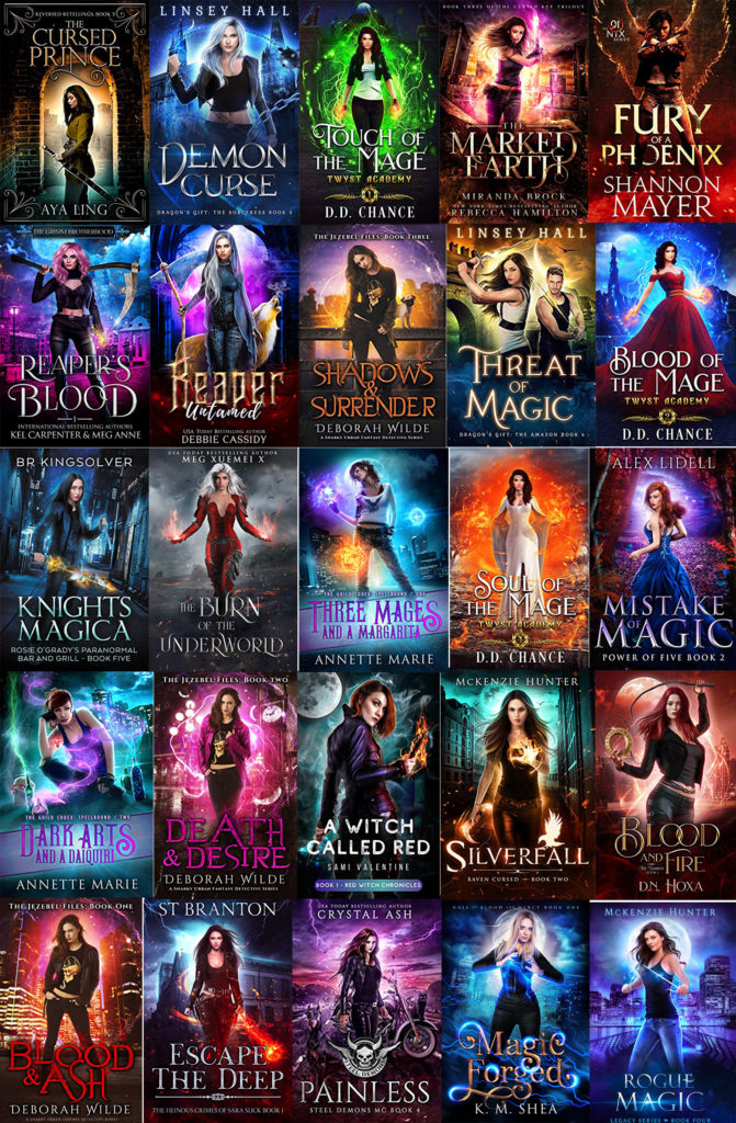
See these urban fantasy covers? They all look like fantasy even small, and the main figures are all clearly visible. How do they do that? The key is contrast.
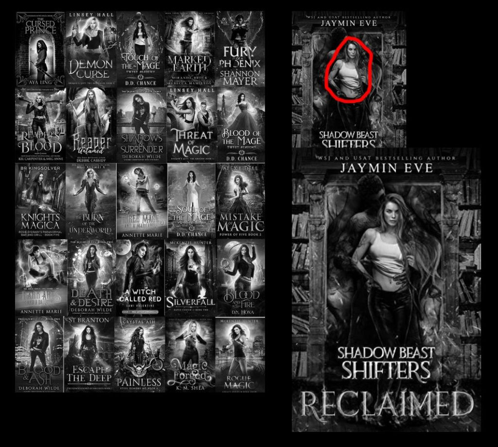
Look at how these covers use value, AKA lights and darks! They typically have a dark figure on a light background or vice versa. That’s why so many urban fantasy covers have glowing magic behind the figure — it gives strong value contrast. Reclaimed does this by having the bright white tank top contrasting with the shadow beast creature behind her.
So when you’re thinking about a potential book cover, think in terms of lights and darks and how they’ll help to create a clear thumbnail that puts the focus on your protagonist.
3) The cover text is just as important as the cover art.
Typography 101 should be a whole separate article, but I want to cover some of the absolute basics. Namely, that you shouldn’t ignore your text. You need potential readers to be able to easily see your title and name!
One of the most common “new to book cover design” mistakes I see is to make the text too small or not take up enough room. t varies by genre, but you usually want at least 1/3rd of the cover to be text.
To demonstrate some good and bad typography, I put together three fake covers with bad typography and one with decent typography.

The image on the far left has the text way to small. It practically disappears and isn’t legible as a result! The next image has the text at a good size… but the font is a particularly illegible script. That’s why you need to be really careful with any sort of script or decorative font, since not all of them are easy to read. The third image has better font choices and a good size… but the color/value combination completely blend into the background, making it hard to read.
The last image I made as my “decent” example. If I was doing real typography for a contemporary romance, I would probably make some changes, but I wanted something simple as an example. I was focused on making the text legible through color choice, font choice, and size. But I also did something else.
Font choice is important because it helps signal genre. In contemporary romance, there’s often a trend of using a sans serif for everything but one word of the title (which is often in a different cover as well). By using this sans serif / script combination, you can help make a book look like a romance. Different genres have different font standards. Fantasy prefers serifs, while sci-fi likes sans serifs. When you set out to learn your genre, make sure you pay attention to the typography.
For some more basics on typography, check out Courtney Milan’s blog post, “How to Suck at Typography.”
Some final words of advice on good book covers…
Remember that a marketable cover isn’t for you or even your current readers — it’s for your potential readers. Covers should make people want to pick up the book! Like it or not, people do judge books by their covers… so make sure your basic design is strong.
Hopefully this guide is helpful if you are looking to make your own covers or need to evaluate potential covers! If you have questions, you’re welcome to leave a comment.